Feb
03
2011
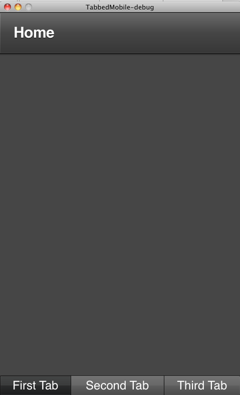
In my earlier post i wrote about a way how you can create a bottom navigation bar in your Flex mobile applications. But recently i came across TabbedMobileApplication which has a Tabbar component built in but the tabbar is on top.
It was fairly easy for me to modify the skin for this application’s TabbedViewNavigator component so that it would have the tabbar in bottom and the viewnavigator on top.
This is how the application looks,

I just copied the skin file from TabbedViewNavigatorSkin and modified it little to achieve the result.
This is how my custom skin class looks as below, you can download the project file here.
package skins {
import spark.components.ButtonBar;
import spark.components.Group;
import spark.skins.mobile.TabbedViewNavigatorSkin;
import spark.skins.spark.ButtonBarSkin;
public class MySkin extends TabbedViewNavigatorSkin {
public function MySkin() {
super();
}
protected override function createChildren():void{
contentGroup = new Group();
contentGroup.id = "contentGroup";
tabBar = new ButtonBar();
tabBar.id = "tabBar";
tabBar.requireSelection = true;
tabBar.setStyle("skinClass", ButtonBarSkin);
tabBar.height = 40;
addChild(tabBar);
addChild(contentGroup);
}
override protected function updateDisplayList(unscaledWidth:Number, unscaledHeight:Number):void
{
super.updateDisplayList(unscaledWidth, unscaledHeight);
var tabBarHeight:Number = 0;
if (tabBar.includeInLayout)
{
tabBarHeight = Math.min(tabBar.getPreferredBoundsHeight(), unscaledHeight);
tabBar.setLayoutBoundsSize(unscaledWidth, tabBarHeight);
tabBarHeight = tabBar.getLayoutBoundsHeight();
}
if (currentState == "portraitAndOverlay" || currentState == "landscapeAndOverlay")
{
tabBar.alpha = .6;
if (contentGroup.includeInLayout)
{
contentGroup.setLayoutBoundsSize(unscaledWidth, unscaledHeight);
contentGroup.setLayoutBoundsPosition(0, 0);
}
}
else
{
tabBar.alpha = 1.0;
if (contentGroup.includeInLayout)
{
var contentGroupHeight:Number = Math.max(unscaledHeight - tabBarHeight, 0);
contentGroup.setLayoutBoundsSize(unscaledWidth, contentGroupHeight);
contentGroup.setLayoutBoundsPosition(0, 0);
}
if (tabBar.includeInLayout){
tabBar.setLayoutBoundsPosition(0, contentGroupHeight);
}
}
}
}
}
Nov
08
2010
When Flex 4.5 “Hero” was announced at MAX i jumped on the chance to play with it. For those who want to get a good basic understanding of how it is different from traditional Flex Application development i would highly recommend this MAX session titled “Deep Dive into Mobile Development using Flex SDK“.
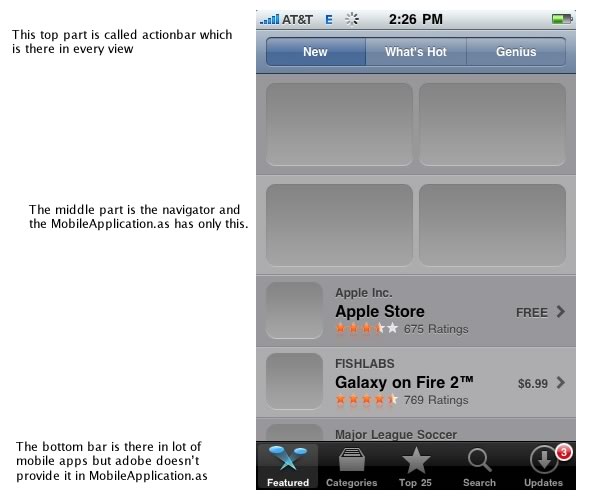
So first thing when i started playing around was that i realized there was no easy way to have a bottom navigation menu like most of the apps. for eg. If you look at the apple app store in the bottom you see the top navigation menu, middle content area and then the bottom bar. The image below explains what i mean by it.

To get this functionality where you have a constant bottom bar and then the views change when you select the buttons, you have to do little bit of coding and here is how you do it.
The project file can be downloaded here.
This is the main file and we don’t have to make any changes to it, this is what you will get when you create a mobile application.
1
2
3
4
5
6
7
8
9
| < ?xml version="1.0" encoding="utf-8"?>
<s :MobileApplication xmlns:fx="http://ns.adobe.com/mxml/2009"
xmlns:s="library://ns.adobe.com/flex/spark" firstView="views.bottombarHome">
<fx :Declarations>
<!-- Place non-visual elements (e.g., services, value objects) here -->
</fx>
<fx :Style source="style.css" />
</s> |
so now lets look at the first view file called bottombarHome, this is where all the action happens.
1
2
3
4
5
6
7
8
9
10
11
12
13
14
15
16
17
18
19
20
21
22
23
24
25
26
27
28
29
30
31
32
33
34
35
36
37
38
39
40
41
42
43
44
45
46
47
48
49
50
51
52
53
54
55
56
57
58
59
60
61
62
63
64
65
| < ?xml version="1.0" encoding="utf-8"?>
<s :View xmlns:fx="http://ns.adobe.com/mxml/2009" creationComplete="view1_creationCompleteHandler(event)"
xmlns:s="library://ns.adobe.com/flex/spark" actionBarVisible="false">
</s><s :layout>
<s :BasicLayout/>
</s>
<fx :Script>
< ![CDATA[
import mx.events.FlexEvent;
import views.*;
protected function one_clickHandler(event:MouseEvent):void {
// TODO Auto-generated method stub
if (!(myNavigator.activeView is One))
myNavigator.pushView(One);
}
protected function two_clickHandler(event:MouseEvent):void {
// TODO Auto-generated method stub
if (!(myNavigator.activeView is Two))
myNavigator.pushView(Two);
}
protected function three_clickHandler(event:MouseEvent):void {
// TODO Auto-generated method stub
if (!(myNavigator.activeView is Three))
myNavigator.pushView(Three);
}
protected function view1_creationCompleteHandler(event:FlexEvent):void {
// TODO Auto-generated method stub
systemManager.stage.addEventListener(KeyboardEvent.KEY_UP, deviceKeyUpHandler);
//add the first view when this view is created
myNavigator.pushView(One);
}
//this is required to handle the device back key
protected function deviceKeyUpHandler(event:KeyboardEvent):void {
// TODO Auto-generated method stub
var key:uint = event.keyCode;
if (key == Keyboard.BACK && myNavigator.navigationStack.length > 1){
myNavigator.popView();
}
}
]]>
</fx>
<fx :Declarations>
<!-- Place non-visual elements (e.g., services, value objects) here -->
</fx>
<s :VGroup height="100%" width="100%" gap="0">
<s :ViewNavigator id="myNavigator" width="100%" height="100%" />
</s><s :HGroup left="0" right="0" bottom="0" gap="0" width="100%" >
<s :Button label="One" id="one" click="one_clickHandler(event)" />
<s :Button label="Two" id="two" click="two_clickHandler(event)" />
<s :Button label="Three" id="three" click="three_clickHandler(event)" />
</s> |
ok i have to admit, putting code like this doesn’t make any sense but you will have to trust me that when you run this application you will have a bottom navigation bar which stays in place all the time during lifetime of your application.
There might be other ways to do it and i would like to know but so far i have found this way to be effective.
It would be cool if inside the MobileApplication.as there would be this functionality to add a bottombar and then every view for that button has a “master” viewstack instead of one single viewstack as it is the case right now.
There is one more way of achieving this you can read about it here.

